A group of packaging vets were starting a new company. They came to me for a logo and left with a brand strategy and identity that has helped them to be considered against established industry players in their first year of business.
The first job was to define who they are as a brand. Why they are here, what they stand for, what they do, what makes them different, who they are for, and what their personality is. Through workshops and consultancy, the brand strategy was formed.
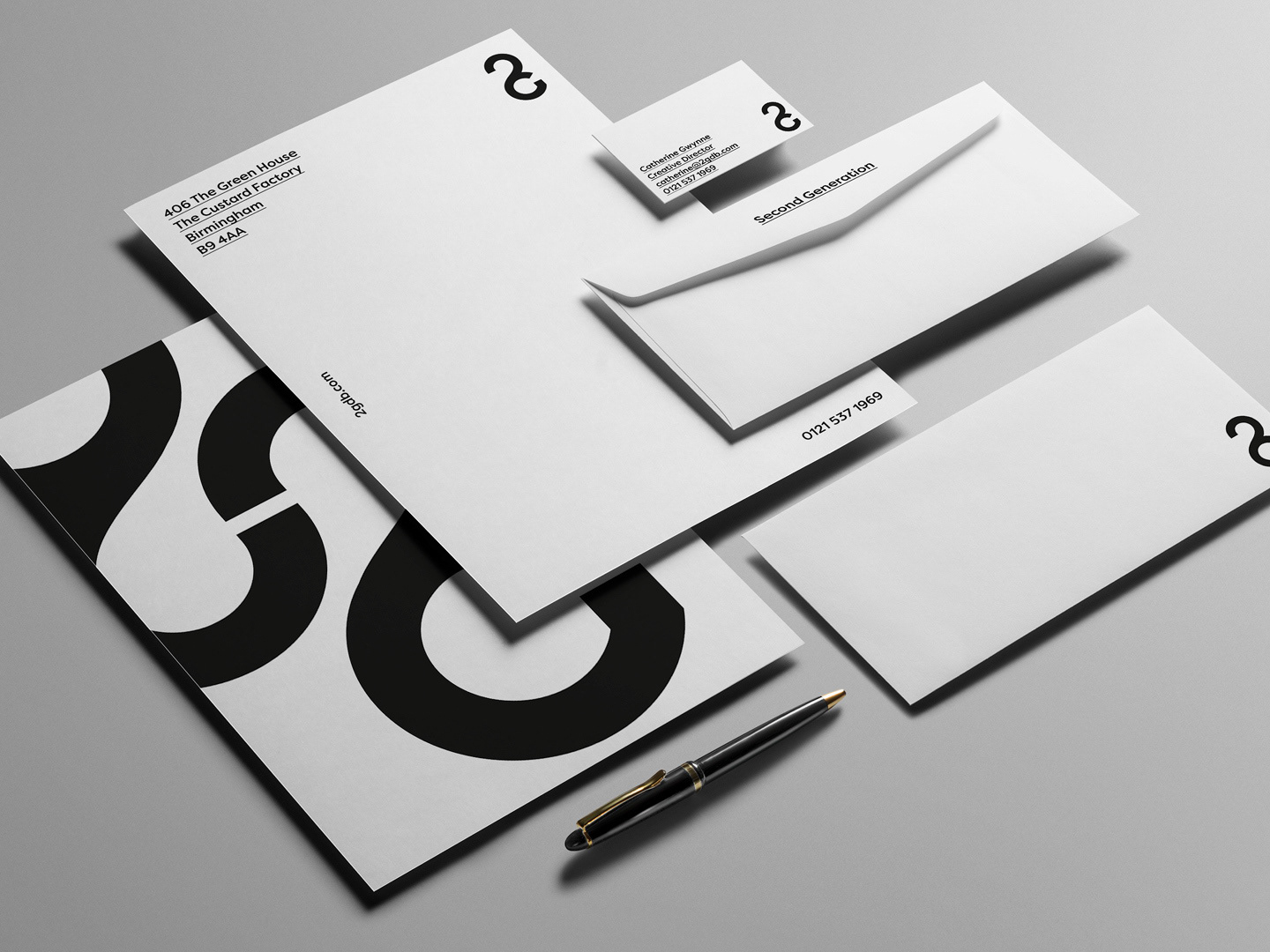
This strategy work fed the brand identity. A bold look to reflect the name they'd come up with and the direction the business was taking. Ripping up the traditional industry business model and offering a new way for brands to get packaging for their products. The dawn of a new era in packaging supply.
CreativePool awarded the work Bronze in the Photography and Branding categories in 2022 with judges saying:
"A great identity that makes what, at first glance can be a slightly boring subject, into a hero. The photography style is distinctive and dramatic. This goes well with the blocky and bold typography. Great job all round."
"I love the photos – really bold, strong and it translated the "Titan" atmosphere with the minimalistic aesthetic. Great choice of colours."
Pillar-like and modular in construction, the logo mark was developed to display strength at all sizes. The negative tittle in the middle of the two T's, a visual expression of dotting the i's and crossing the t's as well as a nod to the people-centric ethos of the company.
A striking colour palette was chosen to stand out from competitors. In application, the bright blue signifies boldly going where others haven't and a flash of yellow highlights new dawn for the industry.
Photography art direction plays with scale and light to emphasise drama, creating a sense of something big, bold and new. A set of ownable brand assets, very different to the generic industry standard Titan is pushing against.
In their first year of business, they have won key clients and have been considered against established industry players. They also have printed copies of the final Brand Book and use them regularly to hold themselves accountable, keeping true to the vision we set up.
